When digitizing historical football programmes, the advertisements often reveal the aesthetic soul of a city. On page 12 of the October 2014 matchday magazine, nestled among standard ads for plasterers and car washes, sits a piece of brilliantly surreal local graphic design: the advertisement for Café de Zolder, a legendary pub located on the Papengang.
At first glance, the logo might trick the eye, but a closer look reveals its bizarre, unapologetic nature. It depicts a green pool table, a red outline of a hand, and a yellow pool cue. But the cue isn’t just striking a ball; the tip of the cue is literally smoking and radiating wavy lines of heat or flames. It is a visual metaphor for a “hot streak,” capturing the fiery, intense, and slightly gritty energy of a late-night pool game in an alternative rock bar.
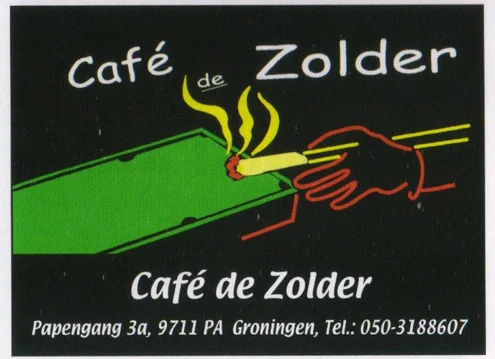
Café de Zolder has always been an institution for students, musicians, and football fans looking for a raw, authentic atmosphere away from the polished mainstream clubs. This hand-drawn, slightly chaotic logo perfectly encapsulates that identity. It stands in stark contrast to the highly sanitized, focus-group-tested corporate branding that usually dominates professional sports environments.
A Look into the Future
By 2026, the world of graphic design has been largely overtaken by sleek, flat minimalism and AI-generated perfection. Logos have become simplified to look good on smartphone app icons. In this modern context, the smoking pool cue of Café de Zolder feels like a glorious relic of a bygone era of local advertising—a time when a pub owner could just draw something weird, print it in the FC Groningen matchday programme, and let the vibe speak for itself. The pub continues to be a cornerstone of Groningen’s alternative nightlife today, proving that a strong, unapologetic identity outlasts any passing design trend.